Trending from G/L: Debating Like A True Marketer

Geile/Leon Marketing Communications

Trending from G/L: Debating Like A True Marketer

These days it seems like there is a debate about something new EVERY DAY.

Some of the topics can be a little, well, trivial in the grand scheme of things, but nonetheless are discussed in fervor on social media.

Are women’s pockets inferior to men’s? Yes, yes they are.
Is St. Louis the microbrew capital of America? Well, no…but we are near the top!
Are hit songs starting to sound a little similar? Yeahhhh.

These kinds of topics can generate some pretty strong opinions that inevitably circulate through our culture. But typically, there’s a decided shortage of facts to backup our claims. That is, of course, what makes these debates more of a matter of opinion. But now, The Pudding is here to shift the conversation from online shouting to in-depth sleuthing.

The site The Pudding has taken these entertaining cultural debates and put an actual answer to them. They conduct their own research and collect original data. Then they showcase their findings in a creative and super digestible way.

They use the “emerging form of journalism” called visual essays to tell their findings. Every essay on the site has interactive graphics to highlight the research and data in a way that is accessible to everybody.

Browsing through, you’ll see that the available essay topics are relevant and intriguing too.

The Pudding has tapped into something our culture didn’t even know we needed. Someone to help us FINALLY settle those debates you and your friends have over drinks on a Friday night.

How’s this relate to advertising? What The Pudding does and what those of us in the marketing world do are in essence one in the same: effectively communicate the truth about a particular topic. Getting to the bottom of what truly makes a brand or product unique and telling that truth in an engaging way is the key to good marketing and advertising. Imagine the latest debate is whether or not to purchase your brand or product. Is a shouting match of “buy” vs. “don’t buy” on social media going to be effective? Probably not. But how about a well-researched campaign that connects the essential truths about your brand to the people who will most likely value those truths? Now you’re talking. That’s what Making It Mean Something is all about, and it’s what we do every day here at G/L.

Great creative work is backed and inspired by great research. When you’re ready to discover the essential truths of your brand and make those truths mean something to your audiences, give us a call.

Designing for Prospective Students

Geile/Leon Marketing Communications

Designing for Prospective Students

Designing for prospective students can be as fun as it is tricky.

Prospective students can tell how adaptable and up-to-date an organization is within seconds of visiting their site or interacting with them digitally. How an organization presents itself online almost certainly mirrors what’s going on behind the curtain, and it’s pretty obvious. There are several basic things to consider when designing for prospective students:

Function and Content is Key

An organization has to be accessible and the interface has to be easy to navigate. Nothing is more frustrating than being unable to find basic information. These prospects want to know what you have to say and they want to be able to access the most information easily. Putting the most important information up front and making is easily digestible is a great way to get students interested in finding out more about the organization.

Good UI Design

Some say that the best design is invisible. At the very least, don’t let the design dictate the function. Design around the user interface and make it as clear and easy to navigate as possible. You want to be able to outline a clear path through the site for the end-user, while allowing them the freedom and flexibility to explore.

Social Media

Incorporating social media can add some honesty and even brevity to a website. It shows that other REAL people are interacting with the organization and may provide a glimpse of what it’s like to be involved. It also gives the end user the ability to share their own opinions about the organization.

Be Honest

No one has a more finely tuned BS meter than young adults. The best thing an organization can do for itself is be completely honest and transparent. In turn, the quality of people you’re trying to reach will be enhanced. This starts with research on the part of the prospect. If they are getting mixed signals on what is being presented digitally, they will find it pretty easy to move on.

Want to talk more about design? Fill out the form below or email us at [email protected] and we will lend our time to discuss your communications and design needs.

[gl-hs-form form_id=’1863abe3-c1e4-43d0-a298-c7b132f8ce03′]

Trending from G/L: Tracking 2018’s Design Trends

Ben Schwab
Creative Director

Trending from G/L: Tracking 2018’s Design Trends

It’s important for any competitive brand that plans on remaining relevant to stay aware and on top of emerging trends within their industry. A large aspect of this involves staying up to date on the ever-evolving visual landscape we find ourselves enveloped by. To cut through this overgrown jungle of visual noise it’s important to not just note and acknowledge these changes in our visual language, but to adjust and adapt with them. Otherwise, we run the risk of fading from view.

Here at G/L we are vigilantly on watch with creative syringes prepped to inject a booster of smart, relevant and modern design trends into work for our clients, ensuring a competitive edge within their respective fields. But don’t take my word for it. There are numerous articles discussing current design trends around the world. Below we highlight some of these trends and how we have incorporated them into our most recent work.

  1. Multiple Brand Color Schemes / Unconventional Colors

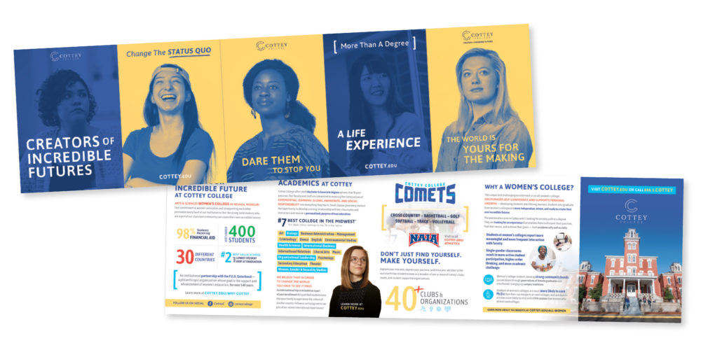
By choosing multiple vibrant and unexpected color schemes for a brand they have an easier time standing out. An example of this practice is best shown in our recent work for Cottey College, an all-women’s college located in Southern Missouri. By leveraging bold, full-floods of color, Cottey has developed a strong, visually modern brand for their school.

  1. Color Gradients / Bold & Handwritten Fonts

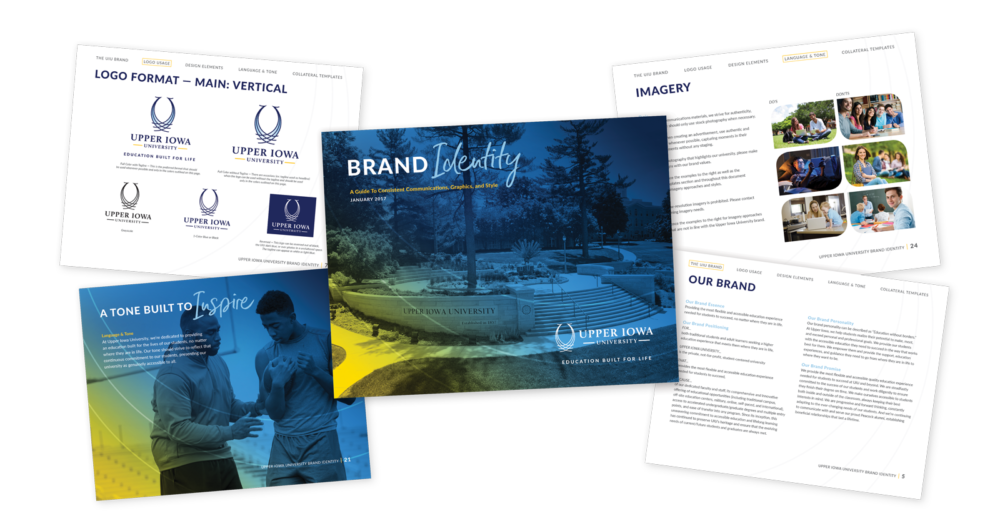
Being raised from the nostalgic grave by the likes of brands such as Instagram, the use of striking color gradients as well as bold, dramatic handwritten fonts has also been on the rise this year. These elements are both represented in our work for our client Upper Iowa University.

  1. Custom Illustrations / Branded Gifs

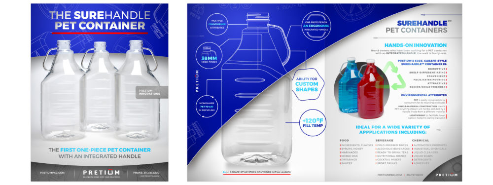
As brands continue to look for further ways of differentiating themselves, we’ve seen a trend in design toward more unique and “ownable” illustrations as well as use of playful animations and branded gifs. We used this approach when rebranding Pretium Packaging. During the process of a brand refresh, we heavily leveraged the unique look of their blue-print line drawings in order to visually tell their story of concept to final production of custom bottles, differentiating them further from other plastics companies.

If you’re looking to get ahead of the curve on design that will carry you and your brand into the future, send us a line. We’ve got the design smarts that are up to date and the design skills that are up to snuff. And if you are interested in more eye-candy, check out the rest of our work here.

Source Article: https://venngage.com/blog/graphic-design-trends/

When Subpar Branding Just Won’t Fly

Randy Micheletti
VP, Director of Brand Strategy

When Subpar Branding Just Won’t Fly

For horse owners, summer is the time for peaceful, early morning rides before the sun heats up the day. It’s a time to spend washing, treating and connecting with your horse. Unfortunately, it is also the season of the most heinous insect on the planet…flies!

And, as all horse owners know, it’s a never-ending battle. You try everything and they just keep returning. Not only are they frustrating to you, they’re even more irritating to your horse. Imagine the way the horse feels as the summer heat kicks in and these pests will not leave them alone.

As we’ve learned from recent client focus groups, many horse owners are convinced there’s not much that can be done to effectively repel flies. Sure, some have regiments that are partially effective but many said during the heavy summer season protecting their horses from flies and other biting insects was a “losing battle.”

Here are a few tips on becoming more effective in the battle against flies and other insects:

  • Eliminate places where flies and insects inhabit and breed such as standing water, old water in a bucket, dirty gutters, or road ditches.
  • Provide your horse with additional protection during peak fly season and avoid being outside during these times.
  • Limit your horse’s exposure to flies and insects by using a fly spray specifically designed to kill and repel a broad spectrum of insects on contact.
  • Implement a fly control program that uses multiple products. Combining fly sprays, fly masks and premise concentrate and bate can provide complete protection for your horse.

Manna Pro partnered with Geile/Leon to introduce a complete line of equine fly control products for all applications, including sprays, masks, face and body wipes, and premise protection. Our knowledge and expertise within the equine category provided the framework to help us build a memorable brand, increase awareness of the new line, and drive sales of Force products.

Check out the launch campaign and the results generated: Drop Dead Powerful

Geile/Leon is a brand-driven marketing agency based in St. Louis, Missouri that specializes in equine marketing and new product introductions. If you’re looking to refresh a brand or launch a new one, let’s chat.

Industry Spotlight: Equine Web Design

Randy Micheletti
VP, Director of Brand Strategy

Industry Spotlight: Equine Web Design

With approximately 9.2 million horses in the U.S. coinciding with approximately 2 million horse owners, the equine care market size has grown to a substantial $900+ million dollar business. That’s nothing to shake a stick at.

The good news is there are many opportunities to communicate with consumers about your equine products; the hurdle though, is that the category is extremely crowded. As a brand, it’s more important than ever to stand out. One way to do that is through your website. It’s vital that equine brands keep up with technology to converse with their consumers…but how can your site stand out from others? Here are a few tips to follow that will ensure your site stands out:

Consistency

I’m sure your brand has created a corporate identity. It’s crucial that you use that guide to ensure your brand and message are communicated consistently online and offline. Continuity within your site is also important – actually, it’s a major factor in conversion. When a consumer moves throughout your site each page must deliver a consistent design and message.

Aesthetically pleasing

Part of being aesthetically pleasing is keeping the overall design as clean and simple as possible. White space is a big part of that. It will allow your visitors to focus on what’s important and help get your key messages across.

Colors and images

This is extremely important, especially with horse owners. The use of warm and inviting colors resonates well with horse owners and it can complement the tone of the copy. The use of imagery is vital in this category. Horse owners love to see photography of horses. Showing a variety of different horses is effective as it broadens your opportunity to reach many horse owners. One thing to keep in mind – as you select an image, be sure it’s relevant and adds value to the message you’re communicating.

Relevant content

Equine sites have to be populated with relevant, keyword-rich content. You might ask, how do I determine if my content is relevant? Well according to Angie Schottmuller of Interactive Artisan, using the “Triangle of Relevance” can help. The triangle strategy incorporates three angles – business interest, user interest and time significance to maximize relevance and content, creating user action.

These are just a few helpers to get you started. One last thing to think about equine web design: always consider who you’re talking to and talk to them in an authentic voice. Horse owners appreciate honesty and a straight forward messaging that helps them understand what is best for their horse(s). Keeping this in mind will keep your brand top of mind with consumers and help solidify the conversion.

Download our Digital Marketing Audit to learn more about successful internet marketing.

[gl-hs-cta cta_id=’c719fe4c-05a6-4de6-8298-b1eb80a48979′]

We have experience with equine; we know the brands, consumers and the products. Let’s talk about what your equine brand is doing to grow through digital marketing and your equine web design. Fill out this form with your information and we will reach out to you!

[gl-hs-form form_id=’d8dfe9c5-7729-4bc1-b7d0-5ccce2aef0e6′]


Healthcare Marketing Blogs

Dan Diveley
VP of Business Development

Healthcare Marketing Blogs

At G/L, we’ve worked on a variety of healthcare marketing projects. Through our years of experience and research, we’ve become something of an expert on the subject, so we’ve compiled all of our relevant insights of the healthcare market in one convenient location. Just click on the headline to view the blog.

Be Disruptive In Everything You Do – Especially Your Healthcare Marketing

When your company brings something unique to the table, it can disrupt the status quo of an entire market. Discover how one of our clients, Metro Imaging, managed to do just that by offering a little extra transparency.

How Effective Healthcare Marketing Can Limit Patient Outmigration

It happens time and time again in the healthcare industry: patients are leaving local hospitals behind for what they (mis)perceive as greener pastures. We take a deeper look into why patients are migrating from their local hospitals and hone in on how hospitals can limit patient outmigration with the right message.

Marketing Accountable Care Organizations – A New Approach

As Accountable Care Organizations trend more towards the mainstream, patients now have a choice for more affordable healthcare solutions. But with a shift in organizational structure comes the need to re-optimize your marketing. If you’ve recently become an ACO or are considering making the jump, we offer you our insights for a clean transition.

Real Price Transparency in Healthcare – I’ve seen it! 

With high-deductible medical insurance on the rise and patient satisfaction falling due to unaddressed price concerns, there’s never been a better time to offer your patients transparency. We examine how much patients value price transparency in healthcare (hint: it’s a lot) and show you how offering true transparency can make your brand stand out.

7 Key Components to Developing a Strategic Healthcare Marketing Plan

Planning ahead for next year? You should be! Here are a few key components you should focus on to maximize your marketing efforts in 2017.

Consumer Engagement: Think Your Marketing is Tough? Try Selling Heart Attacks.

Anyone can make a burger and fries look appetizing or sell you a new sports car. But marketing heart attacks? That’s a whole different animal. Our very own Dave Geile gives his insight on how healthcare marketers can produce viable messaging, even with such serious subject matter.

Creating Effective Healthcare Messaging

Getting the right message out at the right time for the right audience is key for your brand’s success. But how does that translate to healthcare marketing? We take a closer look at what patients are looking for in healthcare and translate their needs into more effective messaging. 

Increasing Patient Volume Requires Thinking Like a Patient

You know the old phrase: “You can’t truly understand someone until you’ve walked a mile in their shoes.” Well, that’s true in healthcare marketing too. We explore what it means to think like a patient and translate that insight into optimized messaging.

Programmatic Buying: How Media Is Changing

The media landscape is ever changing. Are you keeping up? It’s okay; we’ll fill you in.

Healthcare Marketing Includes Understanding the Cares of Patients 

Tired of marketing that just keeps missing the mark? We break it down for you right here, with our own research and insights into healthcare marketing trends and unique solutions. Grab a snack and get comfortable. It’s a longer read, but well worth your time.

Inbound Marketing

Your Digital Budget: How Much Interactive Do I Need? – A G/L Executive Brief

Move over, traditional advertising! The digital world is expanding at an incredible rate, so how much should you spend on marketing in it? We have you covered.

Integrate Inbound Marketing into your next Website and Social Media campaign 

Inbound marketing helps keep the conversation going between you and your target audience, engaging them in a way that traditional advertising just can’t. It’s relatively inexpensive and any company can do it­—we’re doing it right now! Check out how inbound can work for your company’s website and social communications.

A Step-by-Step Guide to implementing an Inbound Marketing Program

So you’re thinking about implementing a little inbound, eh? Lucky for you, we have an easy, step-by-step guide on creating an effective inbound campaign. What are you waiting for? Let’s get the ball rolling!

Target Audience

Example Personas to Improve Messaging

Marketers deal in general target audiences all the time, but sometimes it helps drive the message home if we can put a name and face to that audience. That’s where personas come in. We humanize our target audience by showing them as real people with real dreams and aspirations. See for yourself how your messaging can improve with your own personas in mind!

Why Target Audiences Don’t Work

Your target audience is more than data and research; they’re real people. To get messages that resonate, you have to see them as more than a bunch of numbers.

5 Tips to Remember When Marketing to Moms

We love moms. Our moms, your mom, any moms. They’re all great in their own way! And they’re huge decision makers in their homes, according to our research. So here are 5 tips on how to show them some love in your marketing efforts.

Key Elements to Creating Personas

Personas help make your target audience feel a bit more personal than charts, graphs, and raw data. We feel that creating personas for our target audiences is an integral part of our creative process, and we give you the rundown on how you can incorporate them into your marketing efforts as well.

The Importance Of Personas in Shaping Targeted Messaging

You know what sucks? Getting treated like a number. You know what rocks? When advertisers see you for who you really are! Try using personas to create messaging that hits home with your target audience as a person, not a dataset. [snark: It’s so important to us, we wrote four whole blogs on it!]

Internal Branding/Communications

Minimize Medicare Penalties with Internal Communications

Show of hands: who likes paying Medicare sanctions? Anyone? Yeah, that’s what we thought. So what if we told you that your hospital could reduce their risk of having to pay Medicare sanctions with the brand messaging, both internally and externally? Read on and save!

6 Steps to Building a Brand from the Inside Out

Putting your brand on display for the entire world to see is great, but it means nothing if you ignore one vital ingredient: your people. As we discuss here, a great brand is backed by people who truly believe in the brand they represent on a daily basis. Make it a full team effort!

Healthcare Case Studies

Hannibal Regional Healthcare System – “Guiding You to Better”

We talk a big game about our expertise in healthcare marketing. Fortunately, we have the results to back it up. Check out the work we’ve done with Hannibal Regional Hospital. 

Metro Imaging – The Clear Choice 

Our client, Metro Imaging, has a few innovations up their sleeves that could disrupt the healthcare market, and they wanted us to help show them off. We were happy to oblige.

Have any questions? Contact me (Dan) at [email protected] or fill out the form below.

[gl-hs-form form_id=’1863abe3-c1e4-43d0-a298-c7b132f8ce03′]


Trending from G/L: Time Travel Maps

Ben Schwab
Creative Director

Trending from G/L: Time Travel Maps

How bored are you right this second? Do you currently find yourself tossing pencils upward in an attempt to harpoon the office ceiling? Maybe you’re on the couch binging this year’s Yule Log on Netflix for the second time while scrambling to complete last minute online gift shopping. In the midst of these activities you may begin to wish you had the ability to time travel and control time and space at your will. I’m happy to announce that this holiday season the power described has now been granted to you…sort of.

Since 1984 there have been annual mosaics painstakingly stitched together from satellite imagery of our earth’s surface. The public now has full, interactive access to these maps thanks to the work of Carnegie Mellon University’s CREATE Lab and their Time Machine Library, along with the dedicated effort put forth by the team at Google. Together they have managed to painstakingly transform this immense, static archive of imagery into a user-friendly and navigable tool for exploring the face of our dynamic earth. The resulting images are visually striking and breathtaking in their intricate detail and scope.

It took the folks at Google to upgrade these choppy visual sequences from crude flip-book quality to true video footage. With the help of massive amounts of computer muscle, they have scrubbed away cloud cover, filled in missing pixels, digitally stitched puzzle-piece pictures together, until the growing, thriving, sometimes dying planet is revealed in all its dynamic churn. The images are striking not just because of their vast sweep of geography and time but also because of their staggering detail. Consider: a standard TV image uses about one-third of a million pixels per frame, while a high-definition image uses 2 million. The Landsat images, by contrast, weigh in at 1.8 trillion pixels per frame, the equivalent of 900,000 high-def TVs assembled into a single mosaic.

Along with the obvious novelty inherent in watching your hometown expand outwards over the course of three decades in less than three seconds, this tool also gifts us an opportunity to reflect on how we have and continue to impact our planet.

See anything cool recently? Have you figured out other ways to time travel? Send us a note using the form below:

[gl-hs-form form_id=’1863abe3-c1e4-43d0-a298-c7b132f8ce03′]
 

The Trouble with Design Templates

Ben Schwab
Creative Director

The Trouble with Design Templates

Say you need a one-time solution that cuts down time and cost from production of your print and design pieces. That’s what standardized design templates are for, right? They’re easy to use and promise to alleviate the headache of managing external communication with an agency on a regular basis for every minute project. But sometimes, it’s possible the benefits are offset by some unexpected drawbacks.

Benefits of a Design Templates System

The number one supportive reasoning behind the desire for a template-based system is cost savings. The list below breaks down why, in theory, the use of a template could lead to this desired effect.

  1. Time – Now that a look and layout have been established, your internal art department should be able to easily plug-in copy and photography for production of quick-turn print and digital projects.
  2. Consistency – The use of a template clearly defines guidelines and graphic elements to carry across all artwork, leading to a consistent tone and feel for all of your projects.
  3. Internal – Provides you with the comfort of dealing with your own employees face to face. With proper use of the template, your own art department can handle all projects internally. 

Drawbacks to a Template Design System

Clearly, there are great benefits to using design templates. However, in practice there is a list of drawbacks you should prepare yourself for, including but not limited to:

  1. Time – Having an internal production department handle creation of ads based on a template can take just as much time, if not more, as having the agency handle production of artwork. Since the agency is more familiar with the design, the turn-around on artwork may actually be more cost effective by leaving it in their hands.
  2. Compromised Design – Sacrifice of unique and eye-catching design can occasionally result from simplifying templates to be easier for internal production artists to replicate accurately and quickly.
  3. Longevity – Often changing opinions and direction can force a template to be scrapped after only a short time of use.

There’s no doubt the use of templates can prove beneficial. We have created them successfully for a multitude of clients and continue to do so. But whether the benefits outweigh the possible pitfalls is ultimately up to you and should be carefully considered. If you find yourself in a bind, feel free to lean on us. We’re your resource and are more than willing to help see your project through to completion.

[gl-hs-form form_id=’1863abe3-c1e4-43d0-a298-c7b132f8ce03′]
 

Trending from G/L: Spector typeface tool is coming soon to a creative near you

Geile/Leon Marketing Communications

Trending from G/L: Spector typeface tool is coming soon to a creative near you

Designers and other creative folks find inspiration out in the wild all the time — whether it is a cool package typeface at the grocery store or a unique leaf color they see while walking the dog. They snap a picture on their phone in hopes of figuring out that typeface or sampling that color for a later project. However, it’s usually difficult to accurately identify and recreate these inspirations once back at the desk.

Enter a creative’s new best friend — Spector.

Spector is a handy, working prototype tool designed by Fiona O’Leary that she describes as a “physical eyedropper”. All you have to do is place Spector over whatever you wish to identify and press a button. This tool then cross-references type with a font database to discover its’ name and reads the color to create a RGB and CMYK value. The results are then connected to InDesign for you to use — no more time wasted trying to uncover that mysterious font! Spector even recognizes type size, kerning and leading. Even more time saved when you are trying to achieve a certain layout look.

Check out this video to see Spector in action.

Everyone at G/L was super impressed by Spector. Any tool that increases productivity while also increasing our “visual literacy” is a must have in our book. The only not-so-awesome thing about Spector — you can’t go out and buy it right now. This is a working prototype that can only recognize a handful of typefaces so far. O’Leary does plan on integrating with a much larger database someday. Hopefully we will see Spector on the market in the very near future — we will be first in line tacking anyone who gets in our way!

Have any thoughts? Shoot us a note here and we’ll get right back to you!

[gl-hs-form form_id=’1863abe3-c1e4-43d0-a298-c7b132f8ce03′]
Trending from G/L: Why Ili Means You Wasted Your Time on Rosetta Stone

Geile/Leon Marketing Communications

Trending from G/L: Why Ili Means You Wasted Your Time on Rosetta Stone

Joining the travel agent, newspaper editor, and Blockbuster clerk, the professional translator may be the next to find themselves searching the classifieds, thanks to a new innovation in the field of multicultural communication. The Logbar ili is a new, soon to hit the market wearable translator, the next evolution in translation technology.

One of the first capable of voice recognition and verbal translation, it relies on its own self contained operating system, rather than having to be built around an existing platform like current and unreliable phone applications are. About the size and shape of the original iPod shuffle (and arriving almost a decade after), the first generation ili is currently capable of translating between Chinese, Japanese, and English, facilitating nearly instant multilingual conversation between any combinations of the three. Version two will add French, Thai, and Korean, and version three will add Spanish, Italian, and Arabic.

Without a current list price or the ability to pre-order one, it’s tough to say when this device (and others sure to follow soon) will begin to diffuse through any number of cultures and languages, but the process of instant and accurate translation from a wearable piece of technology is essentially priceless to those in both the business and personal world.

Though currently limited in dialect and surely far from peak efficiency, the ili exemplifies improvements to and enforcement of the current trends in personal technology, being both wearable, and accelerating the ever more important idea of a “glocal” mindset. Like the first run of any groundbreaking technology, I won’t rush out to buy one.

While the concept is exciting and the uses seem infinite, this seems to be a stepping stone in the field of global communication technologies, paving the way for a world with seamless and universal conversation, one, which I can’t be the only one looking forward to.

Have any thoughts? Shoot us a note here.

[gl-hs-form form_id=’1863abe3-c1e4-43d0-a298-c7b132f8ce03′]
 

Contact