When Good Brands Go Bland

Ben Schwab
Creative Director

When Good Brands Go Bland

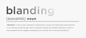
Gliding along for the cultural descent towards the singularity, we are witnessing brands further embracing the warmth of the ever-giving algorithm. Choosing to stand out from the crowd…by not-so boldly blending into it. Over the last few years, a new design trend has emerged. Whether it’s in pursuit of conveying a greater sense of modernity and forward thought or an attempt to protect a brand against unpredictable future cultural criticisms, some brands are abandoning their unique visual identities (and arguably their authenticity) for a series of simplified and minimalist aesthetics. This phenomenon is referred to as “blanding.”

We are gradually finding ourselves adrift in a sea of placid color palettes and sanitized sans serifs. If the exercise of branding is to discover your distinct individuality, and design’s role is to serve as its silent ambassador, then what does blanding hope to accomplish? Well…the opposite of that.

In a time where companies are tasked to take stands and mean something more than a product delivered or a service performed, we seem to be witnessing major brands side-stepping the discussion from a visual identity perspective. The world’s opinion changes too rapidly for them to desire standing out in the crowd anymore. They seem to prefer the safety net of the familiar. The unthreatening. And the unbiased. Since so many messages pose the threat of aging poorly, it feels safer to sanitize yourself. And develop a more neutral persona. But without delivering a unique, memorable and authentic identity…how do you ever plan to excite or inspire brand loyalty?


While I don’t doubt many brands would argue this shift is intentionally done to reflect their dedication to forward thinking and a drive to own a mark that is more easily readable on various digital touchpoints, it’s hard not to interpret the specific design decisions here as a reaction to other trends. Roughly 10 years ago we started having a lot of newer brands who utilize a stripped back aesthetic. Brands like Harry’s Razors come to mind. Here this lack of design provided a level of authenticity and charm that was genuine to small brands who were trying to fill a niche against their larger competitors. Now that those brands have grown in popularity, larger brands want to share that same design language. When you look at it from an algorithm perspective, it makes sense. Users will be fed more of the same content they’ve already interacted with, so it may help to look like everyone else to some degree.


Major examples of brands who have most recently “blanded” themselves include Johnson & Johnson, Burberry and Dribble. And while these brand evolutions aren’t outright offensive necessarily, depending on who you ask, the variety in character, storytelling and instant recognizability between their previous marks and their new presentations is striking.


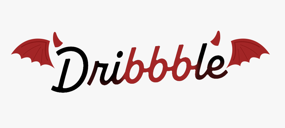
I do appreciate how the triple Bs in Dribble’s new mark share more than a passing resemblance to the mark of the beast. Coincidence you say? Perhaps an omen, I suggest. A message from the ancient design gods, Helveitcus and Bebaszebub. Pleading with us to be weary of further bland, timid identities. We will leave you to decide…but overall, as a designer, I personally feel it’s a shame to see this vibrant and diverse logoscape of legacy marks abandoning so much of themselves through this reductive design exercise. Which feels more like shriveling up to fear than growing the joy to inform. Worse still, I’m getting bored writing about it.


Whether you choose to evolve your brand to be more of a “bland” or not, that evolution should always be strategically driven towards discovering more of a fully realized version of your brand. And delivering a clearer communication of who that is and what it stands for. If that strategy demands a clean, modern sans serif and nothing else…maybe bland simply is your brand. Congrats! But it takes a skilled partner with the knowledge and industry expertise to help brands navigate their own unique messaging through an ever-changing cultural landscape. To stay authentic while still connecting with your evolving audience. At the end of the day, it is always good for any brand to be reassessing and evolve themselves, but it should be done with deeper purpose and intent, empathy and above all else…with the greater goal of making those changes truly mean something.


If you’d truly like your brand to stand out, to make an impact and to reflect who you are as an organization, whether it’s through developing a brand voice and messaging or brand identity, product/corporate naming or a logo design/refresh, let’s talk. We can save your brand from bland, making it relevant to your organization and your market. Get in touch with Tim Leon at [email protected].


Trending from G/L: Tracking 2018’s Design Trends

Ben Schwab
Creative Director

Trending from G/L: Tracking 2018’s Design Trends

It’s important for any competitive brand that plans on remaining relevant to stay aware and on top of emerging trends within their industry. A large aspect of this involves staying up to date on the ever-evolving visual landscape we find ourselves enveloped by. To cut through this overgrown jungle of visual noise it’s important to not just note and acknowledge these changes in our visual language, but to adjust and adapt with them. Otherwise, we run the risk of fading from view.

Here at G/L we are vigilantly on watch with creative syringes prepped to inject a booster of smart, relevant and modern design trends into work for our clients, ensuring a competitive edge within their respective fields. But don’t take my word for it. There are numerous articles discussing current design trends around the world. Below we highlight some of these trends and how we have incorporated them into our most recent work.

  1. Multiple Brand Color Schemes / Unconventional Colors

By choosing multiple vibrant and unexpected color schemes for a brand they have an easier time standing out. An example of this practice is best shown in our recent work for Cottey College, an all-women’s college located in Southern Missouri. By leveraging bold, full-floods of color, Cottey has developed a strong, visually modern brand for their school.

  1. Color Gradients / Bold & Handwritten Fonts

Being raised from the nostalgic grave by the likes of brands such as Instagram, the use of striking color gradients as well as bold, dramatic handwritten fonts has also been on the rise this year. These elements are both represented in our work for our client Upper Iowa University.

  1. Custom Illustrations / Branded Gifs

As brands continue to look for further ways of differentiating themselves, we’ve seen a trend in design toward more unique and “ownable” illustrations as well as use of playful animations and branded gifs. We used this approach when rebranding Pretium Packaging. During the process of a brand refresh, we heavily leveraged the unique look of their blue-print line drawings in order to visually tell their story of concept to final production of custom bottles, differentiating them further from other plastics companies.

If you’re looking to get ahead of the curve on design that will carry you and your brand into the future, send us a line. We’ve got the design smarts that are up to date and the design skills that are up to snuff. And if you are interested in more eye-candy, check out the rest of our work here.

Source Article: https://venngage.com/blog/graphic-design-trends/

Trending from G/L: All’s Whale at IKEA

Ben Schwab
Creative Director

Trending from G/L: All’s Whale at IKEA

A popular story passing through the news cycle earlier this month detailed the failed rescue of a pilot whale near the Thai-Malaysian border. The animal was spotted struggling to breathe and swim on its own. A rescue attempt was performed, but ultimately, they were unable to save the whale. A following necropsy would reveal that the creature carried a gut-blocking count of 80 plastic bags in its stomach.

This story is the latest in a series of reports documenting sea creatures that have been discovered off of the globe’s shorelines, having eaten multitudes of waste. And while each case is shocking and may feel like an anomaly, they have only been increasing in frequency. Overall it is projected that roughly 18 million pounds of plastic waste is deposited into the world’s oceans each year.

In reaction to this incident, the Thai government has considered placing a tax on all single-use plastic bags. But it’s not just governments that are leaping to immediate action on the issue. Following this story, Ikea voiced its growing concern with the issue and created a plan to take action.

Ikea is not only phasing out all of their single-use plastic products, such as plastic straws, plates, cups, freezer bags, bin bags and more by 2020, they’re also aiding consumers to live more sustainably. A series of investments and projects that include a plastics recycling plant, windfarms, and the development of new products such as faucet tap nozzles, solar panels and vegetarian options in their cafes, all contribute to the first steps of their initiative.

Great brands have the ability to do great things – and IKEA is a shining example. Work like this will positively impact IKEA’s image and standing among every audience well into the future – a future that they’re helping to ensure is prosperous for everyone. Here at G/L we appreciate the brands and organizations that do the right thing for right reasons, and are honored to work with them to tell their story.

If you find yourself floundering and in need of assistance with your next world-changing project, drop us a line. We strive for smart and meaningful solutions to problems, both for our clients and for the community we all live in.

For those interested in making a difference and living a more savvy, fun and sustainable existence, here’s some creative solutions for giving second life to those single-use plastic bags.

Trending from G/L: “Black Mirror” Episode Comes To Life

Ben Schwab
Creative Director

Trending from G/L: “Black Mirror” Episode Comes To Life

Fans of the popular Netflix series “Back Mirror” are no strangers to its delightfully dark, prescient perspective on the human condition, our cultural relationship with technology, and how those things will often come to odds with one another. One episode in particular, Nosedive, imagines a world where people can rate each other from one to five stars based on every interaction they have. However, unlike gaining or losing followers over social media, this social credit system directly impacts an individual’s socioeconomic status.

Social Credit System IRL

This may sound like an over-exaggerated interpretation of our personal investment/obsession with social image and acceptance, but it carries an added weight after discovering that this concept may not exist purely within the realm of science fiction. In fact, a form of this big brother monitoring is already rolling out in China.

First announced in 2014, China has begun testing what is essentially a social credit system. This system is currently handled through local councils and non-disclosed tech platforms, and exists to reward those who exhibit anything deemed as positive behavior and punish negative behavior. Individuals would carry a score based upon their observed behaviors and this number can dictate how a person is treated in everyday interactions.

The potential repercussions of these social punishments include such things as denied purchase of plane tickets or hotel rooms, having your Internet access throttled, denied opportunities for better jobs, and even the possibility of open public shaming when labeled as a “Bad Citizen.” While on the positive end individuals can expect perks for high scores such as increased boosting on dating apps, reduced energy bills and better interest rates from banks.

Marketing Takeaways

While we may cringe at the notion of a social credit system applied to human beings, the concept really isn’t all that foreign to brands, PR professionals, marketing professionals and the like. Everything that a brand does, says, tweets and hashtags has an affect, from minuscule to massive, on their overall perception. A run of bad press can destroy a brand’s good standing with consumers, just like a series of positive press can improve a brand’s standing. Say the right things, and a brand’s social credit can earn more loyalty, improved partnerships, etc. But say the wrong things, and face a long, uphill climb to regaining the trust of your audience.

In today’s digital world of screenshots and databases, it’s essential to carefully maintain a consistent message, personality and presence in the market. Just like a product recall can have long-lasting affects on consumer trust, screenshots of deleted tweets can spread like wildfire and have the same long-lasting affects on a brand’s reputation. That’s why it’s important to regularly affirm both, internally and externally, what your brand stands for and how that is communicated.

Looking to evaluate your brand and improve its “social score?” We know a few people who can help with that.

Trending from G/L: Time Travel Maps

Ben Schwab
Creative Director

Trending from G/L: Time Travel Maps

How bored are you right this second? Do you currently find yourself tossing pencils upward in an attempt to harpoon the office ceiling? Maybe you’re on the couch binging this year’s Yule Log on Netflix for the second time while scrambling to complete last minute online gift shopping. In the midst of these activities you may begin to wish you had the ability to time travel and control time and space at your will. I’m happy to announce that this holiday season the power described has now been granted to you…sort of.

Since 1984 there have been annual mosaics painstakingly stitched together from satellite imagery of our earth’s surface. The public now has full, interactive access to these maps thanks to the work of Carnegie Mellon University’s CREATE Lab and their Time Machine Library, along with the dedicated effort put forth by the team at Google. Together they have managed to painstakingly transform this immense, static archive of imagery into a user-friendly and navigable tool for exploring the face of our dynamic earth. The resulting images are visually striking and breathtaking in their intricate detail and scope.

It took the folks at Google to upgrade these choppy visual sequences from crude flip-book quality to true video footage. With the help of massive amounts of computer muscle, they have scrubbed away cloud cover, filled in missing pixels, digitally stitched puzzle-piece pictures together, until the growing, thriving, sometimes dying planet is revealed in all its dynamic churn. The images are striking not just because of their vast sweep of geography and time but also because of their staggering detail. Consider: a standard TV image uses about one-third of a million pixels per frame, while a high-definition image uses 2 million. The Landsat images, by contrast, weigh in at 1.8 trillion pixels per frame, the equivalent of 900,000 high-def TVs assembled into a single mosaic.

Along with the obvious novelty inherent in watching your hometown expand outwards over the course of three decades in less than three seconds, this tool also gifts us an opportunity to reflect on how we have and continue to impact our planet.

See anything cool recently? Have you figured out other ways to time travel? Send us a note using the form below:

[gl-hs-form form_id=’1863abe3-c1e4-43d0-a298-c7b132f8ce03′]


Trending from G/L: Media Planning and House of Cards

Ben Schwab
Creative Director

Trending from G/L: Media Planning and House of Cards

Having that Big Idea is the backbone behind most impactful and memorable advertising campaigns. But, without the ability to properly expand that core concept across available modern media planning in a relevant and clever way, you are possibly squandering an opportunity to enter attention as part of the larger cultural conversation.

Case-in-point would be the work done over this last year promoting the return of the Netflix original series House of Cards. If you’re unaware of it, this popular Netflix bing-watch focuses on scheming politician Frank Underwood, played by Kevin Spacey, who manages to weasel his way to becoming president of the United States through a series backstabbing and nefarious acts. The show recently dropped its fourth season in March.

The media planning was designed to capitalize on the growing media attention given to the real world presidential election cycle by targeting political events and using them as a springboard to promote the reelection of the show’s main protagonist, Frank Underwood. By weaving mock campaign style ads for Frank into commercial breaks during televised events such as CNN’s Republican presidential debate, the spots became more of a topic of discussion in the following weeks than the content of the debate itself.

https://youtu.be/Se44ed4KBMA

The initial ads, which trended across Facebook and Twitter, focused on targeting aired debates and political events leading up to the show’s March launch date. They even went as far as to establish a “campaign headquarters” for the character’s election campaign directly across the street from where the GOP debates were held, bringing the mock campaign style of the television spots to the real world.

When all was said and done, this unique campaign managed to gain 6.6 billion impressions, the most successful launch of a show for Netflix to date. That’s the kind of seamless, timely integration that inspires us at G/L.

Geile/Leon generates tons of unique and captivating ideas like this for our clients every day. Contact us today to learn how we can help your brand tell a compelling story. And if you have any cool examples you want to share with us, we’d be more than happy to see them and chat!

[gl-hs-form form_id=’1863abe3-c1e4-43d0-a298-c7b132f8ce03′]


The Trouble with Design Templates

Ben Schwab
Creative Director

The Trouble with Design Templates

Say you need a one-time solution that cuts down time and cost from production of your print and design pieces. That’s what standardized design templates are for, right? They’re easy to use and promise to alleviate the headache of managing external communication with an agency on a regular basis for every minute project. But sometimes, it’s possible the benefits are offset by some unexpected drawbacks.

Benefits of a Design Templates System

The number one supportive reasoning behind the desire for a template-based system is cost savings. The list below breaks down why, in theory, the use of a template could lead to this desired effect.

  1. Time – Now that a look and layout have been established, your internal art department should be able to easily plug-in copy and photography for production of quick-turn print and digital projects.
  2. Consistency – The use of a template clearly defines guidelines and graphic elements to carry across all artwork, leading to a consistent tone and feel for all of your projects.
  3. Internal – Provides you with the comfort of dealing with your own employees face to face. With proper use of the template, your own art department can handle all projects internally. 

Drawbacks to a Template Design System

Clearly, there are great benefits to using design templates. However, in practice there is a list of drawbacks you should prepare yourself for, including but not limited to:

  1. Time – Having an internal production department handle creation of ads based on a template can take just as much time, if not more, as having the agency handle production of artwork. Since the agency is more familiar with the design, the turn-around on artwork may actually be more cost effective by leaving it in their hands.
  2. Compromised Design – Sacrifice of unique and eye-catching design can occasionally result from simplifying templates to be easier for internal production artists to replicate accurately and quickly.
  3. Longevity – Often changing opinions and direction can force a template to be scrapped after only a short time of use.

There’s no doubt the use of templates can prove beneficial. We have created them successfully for a multitude of clients and continue to do so. But whether the benefits outweigh the possible pitfalls is ultimately up to you and should be carefully considered. If you find yourself in a bind, feel free to lean on us. We’re your resource and are more than willing to help see your project through to completion.

[gl-hs-form form_id=’1863abe3-c1e4-43d0-a298-c7b132f8ce03′]


Contact