Trending from G/L: How Nike’s relationship with LeBron remains timeless

Geile/Leon Marketing Communications

Trending from G/L: How Nike’s relationship with LeBron remains timeless

Sponsorships for professional athletes carry an extreme level of volatility for the simple reason that the outcome of the games they play aren’t predetermined (unless you’re a professional wrestling fan, that is).

It’s remarkable how quickly a golfer like Tiger Woods can watch his stock plummet while Rory McIlroy heads in the opposite direction. It’s incredible to watch a no-name utility infielder like Geoff Blum become a World Series hero in one night. It’s humorous even when it’s for all the wrong reasons and most casual fans probably don’t remember your name.

And then there’s LeBron.

There’s no question that LeBron James is a phenomenal basketball player. His legend was already well known when he was playing in high school, and this was really before the golden age of high school sports clips were available all over the internet. Even before he even played his first professional game for the Cleveland Cavaliers in 2003, Nike had signed him to a deal just short of nine figures.

More than a decade later, that relationship between LeBron and Nike has been accompanied by everything that’s happened on and off the court. On the court, LeBron brought the Cavs to the brink of a title. Then, off the court, there was The Decision.

Shortly after, amid a strong fan backlash, Nike released this iconic spot, attempting to humanize LeBron and explain why he made the choice to leave home:

After winning multiple titles in Miami, LeBron returned home and nearly delivered a championship, falling short in the NBA finals despite a heroic effort.

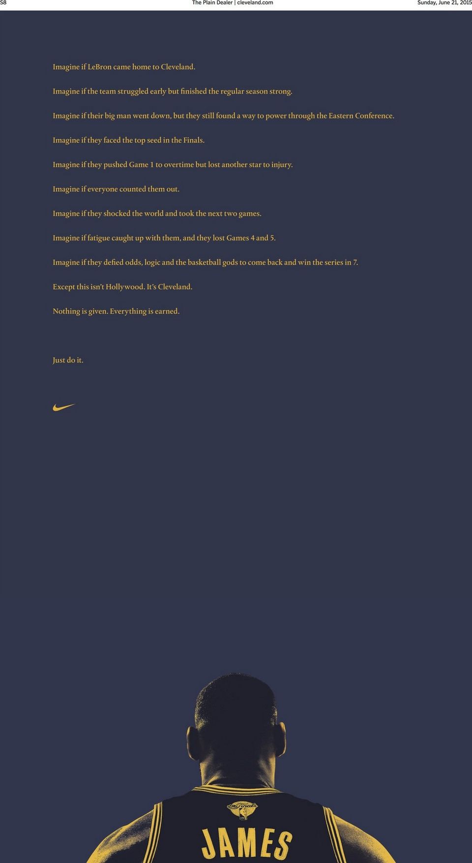
Over the weekend, the Cavaliers and Nike took out a full-page ad in the Cleveland Plain Dealer, thanking the fans for their support and reminding them that the journey is not over.

LeBron

The ad is minimalist, but it strikes the right tone and tells the story that just transpired as well as what lies ahead. For a partnership like this, Nike doesn’t have to be front and center because they’ve been intertwined with his story since the beginning. It allows them to focus more on why people should care instead of trying to just sell shiny new shoes.

Certainly not everyone has the resources that Nike does, but as this ad shows, you don’t need to create something overly flashy to resonate with readers and grow a brand. If you’re ever looking for help your brand take the next step, we’re here to help.

[gl-hs-form form_id=’1863abe3-c1e4-43d0-a298-c7b132f8ce03′]


Trending from G/L: Social Impact Cruises

Randy Micheletti
VP, Director of Brand Strategy

Trending from G/L: Social Impact Cruises

So you say you want to help others. You say you would if it was easy. You say you would if someone would figure it out for you. Well, now it’s time to lose the excuses and do your part to make the world a better place. And, starting in 2016 you can do this on a vacation – a social impact vacation.

With all the negative things going on in the world, Carnival Corp. will launch Adonia; a 710-passenger ship focused solely on social impact vacations. Carnival Corp. CEO Arnold Donald says, “we will cater to an underserved market of consumers who want to make have a positive impact on peoples lives and aren’t always sure where to begin.” He goes on to say, “We believe travel is a meaningful way to allow for personal growth while making purposeful and engaging contributions in the world.”

Carnival

And you know what, I agree with him whole-heartedly. And believe me, I’m not easy to convince when it comes to vacations. I’m one who loves my resort, relaxing in the sun, sand between my toes and a cold drink in my hand. But even I can give a week of my time to help improve the quality of life for others. And if you think you still can’t help, think about a country where the average household income is $6,000 a year and more than two million Dominicans don’t have access to piped water.

With the cruise time to and from the Dominican, each person will get three days on the ground to help make a difference before returning to Miami. Transit time includes great activities such as orientation to the country, conversational Spanish lessons and creative workshops. Once you’re in the Dominican, you have several choices of volunteer activities ranging from teaching English in schools, helping to cultivate cacao plants and building water filtration systems.

For all you naysayers out there (and you know who you are) that say this can’t make a big difference, think about this: with 700 passengers arriving each week – week after week – in the first year alone, that means 18,000 travelers will spend more than 55,000 days volunteering. That’s more than making a small difference. We really can help make a difference in the region.

So give it some thought. Get off your beach chair, put down your umbrella drink and help do your part. It’ll help others and maybe even put a smile on your face too. Price point starts at just over $1,500 per person. To find out more visit www.fathom.org or call 855-932-8466.

[gl-hs-form form_id=’1863abe3-c1e4-43d0-a298-c7b132f8ce03′]
 

Trending Now from G/L: Industry Support, Quirky Brands, New Apps and more

Geile/Leon Marketing Communications

Trending Now from G/L: Industry Support, Quirky Brands, New Apps and more

TRENDING NOW FROM G/L

Every Monday morning, the G/L office starts our week by meeting together and updating everyone on new business, old business, this week’s needs, last week’s successes – all the good stuff. We always take time at the end of these meetings to discuss what is trending now in our marketing and design world. We decided that what we talk about isn’t only beneficial to us, but to our clients and followers – so every Monday morning we share our favorite trends with you.

WHAT WE’RE TALKING ABOUT THIS WEEK

Last week, we talked about companies moving ads onto Instagram, a designers project The Urban Type and more. This week, we are talking about grabbing a beer with Anheuser-Busch InBev, Joe Boxer’s support for binge-watching shows, Samsung embracing the unboxing video trends, breaking up with IE8, Facebook taking on the video space and an app that reads your facial expressions to save pages for you.

“GRAB A BEER”

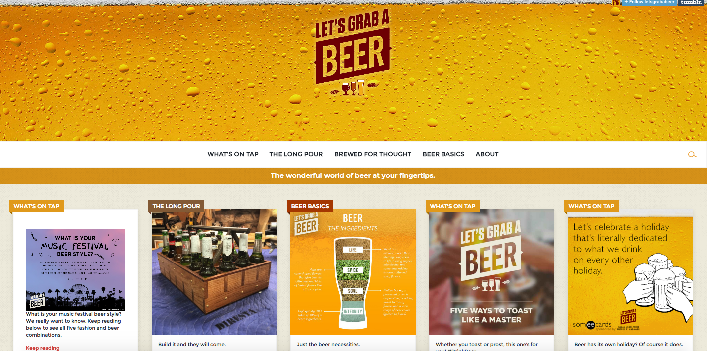
If you weren’t thirsting for a beer before, you may be after seeing this site. Anheuser-Busch InBev recently launched a digital campaign entitled “Let’s Grab a Beer”. The site is aimed at promoting the beer industry as a whole. In fact, if you weren’t looking for who made the site, you may never know it’s from A-B InBev. The site includes infographics, photographs and memes in a Pinterst-esque look and feel. This is a good example to show that your audience wants to hear about the industry, not just about your brand – and ultimately, if the industry benefits then the company does too.

Screen Shot 2015-04-20 at 10.57.37 AM
See the website here.
Read the full article from AdAge here.

INACTIVITY MOTIVATION

Joe Boxer is known for its wacky yet clever ads, specifically around holiday seasons. The brand mentions that in a slow time of year, they came up with something to put them back on the radar – it is known as their Inactivity Tracker. A spoof on exercise trackers, this band rewards users for doing nothing. The brand says it encourages slowing down and spending time in pajamas in this crazy world – but does so while showing the quirky personality of the brand. The product is accompanied by a video, a content hub and a PR push.

Screen Shot 2015-04-20 at 11.07.35 AMRead more about the product, and how to get it, in the article from AdAge here.

SAMSUNG EMBRACING THE TRENDS

“Unboxing” videos have become wildly popular in the tech world. Consumers record themselves taking their phone out of the box for the first time and reviewing the look, feel and features on camera. Samsung acknowledged that this is a steady trend in the tech world and made new ads out of their own professional unboxing videos. The brand uses each unboxing video to introduce the product and (at least) one specific feature to the viewer. These ads show that Samsung is in-tune to what their tech world is consuming and committed enough to tailor their style of reach to what the audience will already be looking for. Though action packed and filled with drama, the message the ads convey is the same message a tech reviewer at home would post.

Watch the videos:

https://www.youtube.com/watch?v=ll0iK6fIsI8

https://www.youtube.com/watch?t=40&v=NEhhIM6K_2o

https://www.youtube.com/watch?v=efjaZeGFWis

Read the full article from AdWeek here.

IT’S OVER, IE8

I think most of us at G/L broke up with Internet Explorer long ago, but because of a influx of new users and the six year anniversary of IE8, a website to help you realize your worth and relationship needs out of a browser has launched. This is the break-up with your IE8 browser site…and it is harsh. The website walks you through the break up, it tells you why you’re ready to let it go or encourages you that your choice to leave is the right one. Once you make your decision, this website has you tell IE8 in 100 characters why it just isn’t working out and then these reasons get displayed on the website for everyone to relate to.

Check out some of our favorite break-up statements:

Screen Shot 2015-04-20 at 11.25.41 AM

See the website for yourself here.

FACEBOOK IN THE RUNNING

Brands (such as Popsugar, BuzzFeed, Jimmy Kimmel Live, and more) are creating video specifically for use on Facebook, leading to Facebook’s transition as a leader in video streaming. This appears to still be unfolding, as there are many thoughts to pre-roll ads, user experience and insights – but marketers are interested in learning more. Facebook targets by age, gender and location among other benefits, so it would be no surprise that brands start investing more in videos tailored to Facebook instead of (or in addition to) YouTube. Facebook has been approaching this from a small and medium size business perspective as well by encouraging them to learn more about the benefits of video uploaded to Facebook and how that performs compared to photos and text posts. In addition to Facebook’s push to keep more content within their platform, we’ll be keeping an eye out to watch this shift continue to unfold.

Read the full article from AdWeek here.

SMILE SUGGEST: SMILE FOR YOUR FRONT FACING CAMERA

Smile Suggest is an app for your browser that (when turned on) uses your front-facing webcam to detect when a website makes you smile. Once it detects a smile, it saves the page for you that you can revisit later or share with friends. It’s a little bit of creepy and awesome at the same time – who knows, it could be the first step to never needing to navigate manually again, like the Xbox Kinect.

Watch the video.

See the website here.

Want to talk these trends with us? Did you see an interesting trend we haven’t talked about? Let’s chat. Connect with us on Twitter or Facebook.

Did you miss the last trends we shared? See them here.

Equine Web Design: 5 Brands Telling Their Stories Well

Geile/Leon Marketing Communications

Equine Web Design: 5 Brands Telling Their Stories Well

Marketing, PR and advertising all aim to tell stories of the brand. Telling a story digitally can be a challenge – especially in an industry where the audience is knowledgeable and looking to connect personally in a digital experience. The Equine industry is one that features many great stories of the relationships between humans and horses. In addition to being a labor of love for many involved, it is also a booming business which includes millions of horses and more than 1.5 million jobs. We have learned in our time working with our client, Manna Pro, that success is achieved in the equine industry (and many other similar, niche industries) by telling the audience a story and showing authentic personality through all communication mediums.

A number of companies and organizations accomplish storytelling through custom imagery and video that shows personality. In a world where stock images are everywhere, websites that have their own images really stand out. Some G/Lers met with our Web designer and came up with equine websites that we think successfully connect to their audience by showing personality – from imagery to content:

Note: Our Geile/Leon team has worked on Equine Web Design projects, including Manna Pro Product’s Equine blog. (We got all this knowledge from somewhere!) For the sake of staying as unbiased as possible, we haven’t included that project in the list below, but certainly feel free to check it out!

Screen Shot 2015-04-15 at 3.48.46 PMhttp://info.mannapro.com/equine
trainwithtrust.mannapro.com 

1. Cavallo

Website: Cavallo makes horse boots, saddle pads and equipment for riders. Their website stands out because of strong imagery, easy navigation and a focus on telling the story of how their products help both horses and riders perform at their very best. In addition to the store, the site’s content is boosted by a robust blog, general information on riding as well as testimonials and other information about the company.

Personality: Our team enjoyed how Cavallo invested in original imagery that shows the brand personality and their love for horses. They’re not just selling a product, but also selling a lifestyle. Putting the president of the company with the horses they work with every day makes her seem very down to earth.

Screen Shot 2015-04-10 at 12.08.53 PMScreen Shot 2015-04-10 at 12.09.07 PM https://www.cavallo-inc.com

2. Justin Boots

Website: The website for Justin Boots conveys a tone that shows the brand’s origins dating back to 1879 while also focusing on how they’re continuing to improve today. There’s a lot of rich imagery showing different age groups enjoying their products. In addition to still photos, they utilize a decent amount of video to tell more complex stories.

Personality: The website has some authentic photography that features their products and the people that use them. This provides another glimpse into the personality of the brand and how it connects to horses and horse lovers. Reaching across different audiences is tough, but the varying photography also shows how the products work for everyday life as well.

Screen Shot 2015-04-10 at 12.11.13 PM Screen Shot 2015-04-10 at 12.11.01 PMhttp://www.justinboots.com

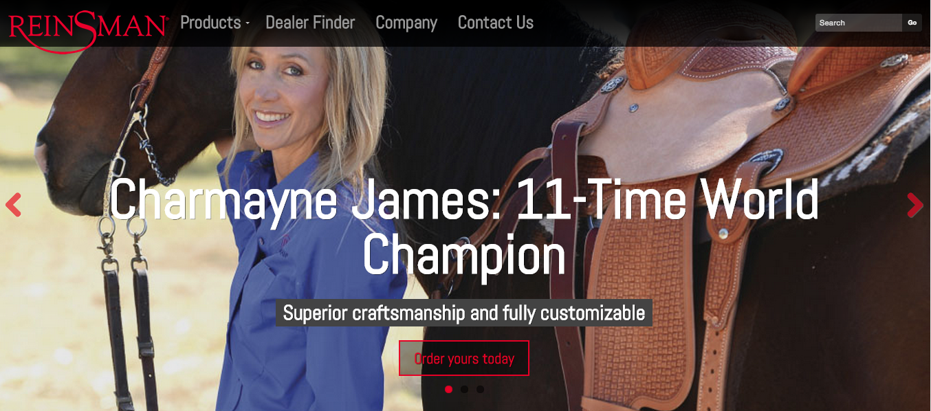
3. Reinsman

Website: The western riding equipment heavily leverages their celebrity/athlete partnerships to highlight the competitive quality of their products. Their equine content is very crisp and well organized.

Personality: Seeing people with their horses and the actual Reinsman products makes the site more authentic. Their focus is more on how the products are more competitive and built to help you compete – showcased well by using images of well known professionals using the products.

Screen Shot 2015-04-10 at 12.18.30 PMScreen Shot 2015-04-15 at 3.42.00 PMhttp://www.reinsman.com

4. Grand Meadows

Website: The imagery on the Grand Meadows site does a good job of blending the quality of the product with the effects of what that product brings to the end user. By making that personal connection, it makes the site about more than just e-commerce. Also, having that combination of regular blogging and more in-depth feature articles also helps the site bring in inbound traffic.

Personality: The focus on helping horses grow makes them seem like they truly care about the horses wellbeing, which is really awesome. Seeing the owner insert herself into the brand and the industry also adds a strong personal touch.

Screen Shot 2015-04-10 at 12.22.34 PM Screen Shot 2015-04-10 at 12.22.44 PM Screen Shot 2015-04-10 at 12.22.23 PMhttp://www.grandmeadows.com

5. Noble Outfitters

Website: Another great example of digitally highlighting the culture of the brand. The Noble Outfitters online magazine is updated more than once a week with a good mix of product features and info related to those who might use the product.

Personality: There’s a lot of great original photography that makes them stand out. Their focus seems to be on highlighting the brand will help end users perform better while looking stylish in the process.

Screen Shot 2015-04-10 at 12.20.15 PMhttp://www.nobleoutfitters.com

Does your brand tell a story well? Share it with us! Connect with us via @GeileLeonSTL, or just email us at [email protected].

Interested in more of our equine work? Check out our previous blog about equine web design!

Trending Now from G/L: Ads on Instagram, an Art Director for Change, Honda’s Never-Ending Ad and more

Geile/Leon Marketing Communications

Trending Now from G/L: Ads on Instagram, an Art Director for Change, Honda’s Never-Ending Ad and more

TRENDING NOW FROM G/L

Every Monday morning, the G/L office starts our week by meeting together and updating everyone on new business, old business, this week’s needs, last week’s successes – all the good stuff. We always take time at the end of these meetings to discuss what is trending now in our marketing and design world. We decided that what we talk about isn’t only beneficial to us, but to our clients and followers – so every Monday morning we share our favorite trends with you.

WHAT WE’RE TALKING ABOUT THIS WEEK

Last week, we talked about brand storytelling, social media wins, Web design and knowing your audience. This week, we talked about companies moving ads onto Instagram, a designers project called The Urban Type, Honda’s never-ending commercial and brands targeting audiences for long-term loyalty effects.

INSTAGRAM ADS

Instagram (owned by Facebook) is a social platform for mobile image sharing. Recently, Instagram announced the launch of carousel ads. Brands including Showtime, Banana Republic, Old Navy, L’Oreal Paris and Samsung are now using this new feature.

Screen Shot 2015-04-13 at 2.32.43 PM Screen Shot 2015-04-13 at 2.32.31 PM

Read the full article from AdWeek’s Social Times here.

THE URBAN TYPE EXPERIMENT

An art director in Chicago set out to grab people’s attention on a commonly ignored platform. You’ve all probably seen them at some point – the signs which beg for help along the streets. Each week, this art director sets out to meet a new homeless or less fortunate individual asking for help on the streets. He listens to their stories and creates a custom sign for them and then catches back up with them to measure the results.

Take a look:

Screen Shot 2015-04-13 at 2.37.45 PMScreen Shot 2015-04-13 at 2.38.37 PM

See all of his signs and follow his story here.

THE NEVER-ENDING AD

This is the ad that never ends…literally. Honda worked with mcgarrybowen agency in London to create the first never-ending YouTube film showing a Honda on an “infinitely” looping road. The companies shot the film with effects of day, night, sun and rain. The film recognizes the time and weather and displays the car driving in that scenario.

See the making of the ad below:

Read the article from Creative Review here.

CREATING LOYAL CONSUMERS FROM CHILDHOOD

Brands target children and teens all the time – but some specific brands have sought out ways to target a younger audience that will gain turn them into loyal consumers for the rest of their lives. Advertisements and marketing materials for female products have switched gears from speaking to the moms and big siste   rs of the world and are going straight to the awkward conversation with Tweens. Brands like Kotex and Aerie are catching on.

See an example of an ad targeting the tween girl below:

Read the full article from NPR here.

Want to talk these trends with us? Did you see an interesting trend we haven’t talked about? Let’s chat. Connect with us on Twitter or Facebook.

Did you miss the last trends we shared? See them here.

Trending Now from G/L: Brand Storytelling, Groupon’s Social Win, Web Design and Knowing Your Consumer

Geile/Leon Marketing Communications

Trending Now from G/L: Brand Storytelling, Groupon’s Social Win, Web Design and Knowing Your Consumer

B2B

TRENDING NOW FROM G/L

Every Monday morning, the G/L office starts our week by meeting together and updating everyone on new business, old business, this week’s needs, last week’s successes – all the good stuff. We always take time at the end of these meetings to discuss what is trending now in our marketing and design world. We decided that what we talk about isn’t only beneficial to us, but to our clients and followers – so every Monday morning we share our favorite trends with you.

WHAT WE’RE TALKING ABOUT THIS WEEK

Last week, we talked about innovative technology, how brands are positioning themselves and algorithm changes to know for clients. This week, we discussed amazing ways brands are telling stories, a social media win by Groupon, Web design and knowing your audience.

BRAND STORYTELLING

By Generation
Nike came out with a new ad called Ripple. This ad is the epitome of storytelling as it shows two generations of golf meeting one another, involving the brand through the entire journey. Nike isn’t prominent in the video, you may not even know it is a Nike ad until the very end. This is a characteristic of great brand storytelling – get your audience to remember the story and they will, in turn, remember the brand telling it.

https://www.youtube.com/watch?v=CdhWhgA8Y0A

Using Real-Time
Baseball is a sport of history. This year, Major League Baseball moves forward with a real-time approach to what baseball is and means to all of us right now. This isn’t just one ad, but a season-long campaign called “This Is Baseball.” This campaign will celebrate memorable plays and outstanding players and teams as the season unfolds.

Read the full story from Ad Age, and watch the new ads here.

GROUPON FTW

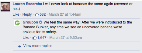
So often we see brands failing on social media, this week we talked about Groupon winning at planned social media. Groupon knew that the product they were promoting strongly resembled a very, very different product. They knew the joke, with a product like this, how could you not? Instead of cowering away from the subject, Groupon embraced it and planned the post knowing it could be trolled and prepared for the responses.

Here are a few of our (more appropriate) favorites:

Screen Shot 2015-04-06 at 12.21.54 PMScreen Shot 2015-04-06 at 12.26.09 PMScreen Shot 2015-04-06 at 12.22.26 PMRead the full story from Ad Week about how Groupon planned the post here.
Read the full story from Ad Week about the responses to the post here.

(If you are reading this at work, then you’re welcome for not including a picture of the Banana Bunker with our brief; can you imagine what your co-worker would think? Product shopping for your produce while on the job is a definite no-no.)

NOT JUST FOR YOUR CLIENT

When we share trends, we like to keep in mind what will move our clients’ brands forward as well as our own. If we’re always giving the best advice to our clients, we should do the same for ourselves, right? So, if you are a part of an agency, consider the next few trends to assist in processes for your clients and your own brand.

Web Design
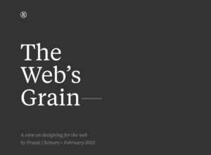
Screen Shot 2015-04-06 at 11.58.44 AMFrank Chimero, a Brooklyn Web designer and Missouri State University , created a website interpretation of his talk from Webstock 2015. The website shows the process of Web design from Dial-Up to the future and all the challenges that designers and brands may face along the way with how to overcome them. We encourage using his talk and website as a resource for Web design and transformation.

View his website here.

Big Music Needs Big Budget
Established songs and artists require high financial stakes. It makes sense for a brand to want to associate itself with an already successful piece of culture; however, it also speaks volumes for a brand to connect with an artist on-the-rise and take advantage of the opportunity to build campaigns and partnerships that benefit both parties. The artist gets some much-needed exposure and the brand gets a sound of its own without the price tag (which frees up some budget to be reallocated to support the campaign).

Read the full assessment from Ad Age here.

4 Out of 5
IBM released a study stating that 4 out of 5 consumers feel that a brand doesn’t know them as individuals. Even more, 80% of marketers think they understand their audience. Yikes. As an agency, it is part of our job to research and connect our brands to their audience in an authentic way. So where is this divide coming from? How do we fix it?

Read the full story from Bulldog Reporter here.

The long weekend brought us a lot of information; want to talk about these trends with us? Did you see an interesting trend we haven’t talked about? Let’s chat. Connect with us on Twitter or Facebook.

Did you miss the last trends we shared? See them here.

Trending Now from G/L: CLIP, Millennials and Interactive Websites

Geile/Leon Marketing Communications

Trending Now from G/L: CLIP, Millennials and Interactive Websites

TRENDING NOW FROM G/L

Every Monday morning the G/L office starts our week by meeting together and updating everyone on new business, old business, this week’s needs, last week’s successes, all the good stuff. We always take time at the end of these meetings to discuss what is trending now in our marketing and design world. We decided that what we talk about isn’t only beneficial to us, but to our clients and followers – so every other Monday morning we share our favorite trends with you.

WHAT WE’RE TALKING ABOUT THIS WEEK

Last week we talked about 3-D printing, this week we have another side of production called CLIP, we talk about how to win over millennials and an inspiring interactive web exhibit.

CLIP

Continuous Liquid Interface Production is a technology that grows parts instead of printing them. CLIP is different than 3-D printing because of the speed and its use of light and oxygen.

See a video below and read more about it here.

https://www.youtube.com/watch?v=UpH1zhUQY0c

BRANDS LEADING MILLENNIALS

Brands like Coca-Cola, McDonald’s and Dove have been attempting to influence happiness in their consumers. In 2015, now more than ever, these brands are committed to making the world a happier place starting with millennials. A study by ZenithOptimedia says that inspiring happiness is going to secure a relationship between these brands and millennials for the long haul. These brands have the right idea, whether it is to actually change the world or only to create loyal consumers, it’s working.

Read the full story from AdWeek here.

INTERACTIVE EXHIBIT

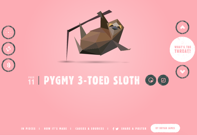
Screen Shot 2015-03-23 at 11.29.26 AMInteractive websites are all the rage. Combine interactive websites with brands wanting to do good and change the world (see trend above) and you get a site worth sharing. In Pieces is an interactive exhibition and study into 30 of the world’s both most interesting and endangered species. Bryan James lays out each animal and their information literally in 30 pieces.

Experience it yourself here.

Want to talk trends with us? Let’s chat. Shoot us an email or connect with us on Twitter orFacebook.

Did you miss the last trends we shared? See them here.

Contact