A Crash Course In Marketing Your Online Courses

Geile/Leon Marketing Communications

A Crash Course In Marketing Your Online Courses

Today nearly every university offers online courses to both full-time and part-time students, making online courses a rapidly growing component of an increasingly digital age. Online enrollment is the fastest growing segment of higher education and is expected to jump to 5 million by 2020*.

While these universities offer online courses on topics like marketing and business analytics, many of them don’t seem to practice what they preach. Or, perhaps more likely, many universities haven’t adjusted what they preach to reflect the new age of digital marketing and data-driven business solutions. Here are few tips based on our experience in promoting online course:

The A-B-Cs of Online Course Marketing Efforts

Three important factors in getting the most out of your online course offerings are awareness, enrollment and retention, and full-funnel reporting for attribution reporting and campaign optimization.

A: Awareness

It shouldn’t be a surprise that program awareness is critical to your success. Our experience has been that Google, Yahoo and Bing are the most likely places prospective student visit to start their search. But with so many universities all vying for the same audience on these sites, it can be very confusing to decide which school is the best choice.

We believe the best way to attract the best-fit student is for university marketing and enrollment staff to first fully understand their school’s brand, its unique point of distinction. Then clearly define the target audience. And finally, build awareness by communicating to this audience via succinct and effective targeted messages.

Through digital advertising, universities can target a very specific student based on their online browsing habits and self-selected interests on social media. With the right set of analytics, you can develop messaging based on where the student’s level of interest is, whether that be just beginning their research into programs or ready to enroll. Additionally, utilize retargeting to reach and optimal level of frequency to raise awareness, impart the brand message and provide students with definitive reasons to choose your program.

B: Enrollment and Retention

The success of your online education marketing isn’t measured strictly in enrollment alone, it’s measured in enrollment and retention. That’s why it’s important to maximize your dollars in getting the enrollment and retention that you need. What’s your cost per enrolled students? How much higher is the cost per retained student? Your goal should be for those numbers to be as close to being identical as possible – that means developing the right messaging, on the right media channels, for the right people to attract the right, quality students. Enrollment and retention is often a result of communicating the university’s brand promise, and communicating it in a way to proper inform prospective students so when they chose your school, their experience will fulfill their expectations which leads to a satisfied and retained student.

C: Full-funnel Reporting

Digital marketing is one of the most trackable forms of marketing. It is possible to track the number of times a prospective student sees an ad down to which ad converted that student into a retained student. A full-funnel marketing is the best approach to marketing online course. It ties together the ‘top of the funnel’ efforts such as brand building and awareness to the ‘bottom of the funnel’ actions taken by prospective students. Universities can be incredibly efficient with their marketing dollars and optimize campaigns on the fly. With a full funnel view, you can shift budget dollars mid-cycle to the marketing channels that are converting the most students. From initial awareness to final enrollment, a full funnel marketing program and the proper analytics, you will identify the best performing messages, channels and call-to-actions for each online program offered. And to tie it all together, we recommend a marketing automation dashboard for data reporting and to monitor the entire enrollment funnel.

We’ve Got Answers!

Need help in increasing the efficiency of your online course advertising? To start, we offer a low cost digital audit so you can see how you compare to other schools in your consideration set. Call Dan Diveley at 314-727-5850.

Next lesson: Market Targeting – Hit Your Bullseye     

* Source: OCS 2016 Report


Trending from G/L: Millennials Get The Best of Both Worlds With Agrihoods

Melissa Ross
Digital Content Producer

Trending from G/L: Millennials Get The Best of Both Worlds With Agrihoods

You’ve heard it before and have seen the headlines: “Millennials Are Killing The So-And-So Industry.” Everywhere from diamonds to napkins, millennials are being blamed for the downfall of many industries that were once booming in the past. And now there’s another thing to add to the list: Country Clubs.

In the 1990’s, baby boomers flocked to tiny golf communities because of the status that went along with it: the real estate was highly coveted because of the green space and beautiful views. But it seems that those that may have grown up in these types of groomed neighborhoods aren’t as interested in buying. Instead, they favor farm-to-table eats, the idea of environmentally friendly living and reducing one’s carbon footprint, but without giving up luxury amenities. Enter the Agrihood.

Short for “agricultural neighborhoods,” agrihoods, according to Business Insider, are “master-planned housing communities with working farms as their focus with ample green space, barns, and outdoor community kitchens. Some boast greenhouses and rows and rows of fruit trees. The homes are typically built to high environmental standards – think solar panels and composting.”

But these aren’t off-the-grid communities with tiny houses. In one agrihood in Palm Springs, California, homes are ranging from the high $300,000s up to $1 million. Millennials are paying big bucks for access to the communal farms, orchards, fresh food, community events, and nature.

With about 150 agrihoods across the country, a large percentage of which exist near larger cities, the attractiveness of getting sustainable living without having to give up big city amenities is another big attractor for millennials, who make up the largest segment of American homebuyers today.

What’s the rise of agrihoods mean to us? That the big growth in lifestyle markets we’ve already seen might be just the start. Our clients that supply products for weekend farmers/ranchers, hobby farmers, gentleman farmers, backyard gardeners, etc. have seen tremendous growth in recent years as millennials seek more and more to break from big city life and live more community-focused lives. But what started as a trend has quickly begun to look like a full-blown movement.

Millennials are blamed for “killing” a lot of industries. And while this generation continues to become a larger portion of the workforce and earn higher salaries, they’re in turn producing incredible growth in new and existing industries as well. Don’t let your brand be the next millennial victim. Contact Geile/Leon today, so we can help your brand find that sweet spot in your marketing communications – because your brand doesn’t want to just be a household name, you want it to be an agrihood name.

Designing for Prospective Students

Geile/Leon Marketing Communications

Designing for Prospective Students

Designing for prospective students can be as fun as it is tricky.

Prospective students can tell how adaptable and up-to-date an organization is within seconds of visiting their site or interacting with them digitally. How an organization presents itself online almost certainly mirrors what’s going on behind the curtain, and it’s pretty obvious. There are several basic things to consider when designing for prospective students:

Function and Content is Key

An organization has to be accessible and the interface has to be easy to navigate. Nothing is more frustrating than being unable to find basic information. These prospects want to know what you have to say and they want to be able to access the most information easily. Putting the most important information up front and making is easily digestible is a great way to get students interested in finding out more about the organization.

Good UI Design

Some say that the best design is invisible. At the very least, don’t let the design dictate the function. Design around the user interface and make it as clear and easy to navigate as possible. You want to be able to outline a clear path through the site for the end-user, while allowing them the freedom and flexibility to explore.

Social Media

Incorporating social media can add some honesty and even brevity to a website. It shows that other REAL people are interacting with the organization and may provide a glimpse of what it’s like to be involved. It also gives the end user the ability to share their own opinions about the organization.

Be Honest

No one has a more finely tuned BS meter than young adults. The best thing an organization can do for itself is be completely honest and transparent. In turn, the quality of people you’re trying to reach will be enhanced. This starts with research on the part of the prospect. If they are getting mixed signals on what is being presented digitally, they will find it pretty easy to move on.

Want to talk more about design? Fill out the form below or email us at [email protected] and we will lend our time to discuss your communications and design needs.

[gl-hs-form form_id=’1863abe3-c1e4-43d0-a298-c7b132f8ce03′]

Trending from G/L: Tracking 2018’s Design Trends

Ben Schwab
Creative Director

Trending from G/L: Tracking 2018’s Design Trends

It’s important for any competitive brand that plans on remaining relevant to stay aware and on top of emerging trends within their industry. A large aspect of this involves staying up to date on the ever-evolving visual landscape we find ourselves enveloped by. To cut through this overgrown jungle of visual noise it’s important to not just note and acknowledge these changes in our visual language, but to adjust and adapt with them. Otherwise, we run the risk of fading from view.

Here at G/L we are vigilantly on watch with creative syringes prepped to inject a booster of smart, relevant and modern design trends into work for our clients, ensuring a competitive edge within their respective fields. But don’t take my word for it. There are numerous articles discussing current design trends around the world. Below we highlight some of these trends and how we have incorporated them into our most recent work.

  1. Multiple Brand Color Schemes / Unconventional Colors

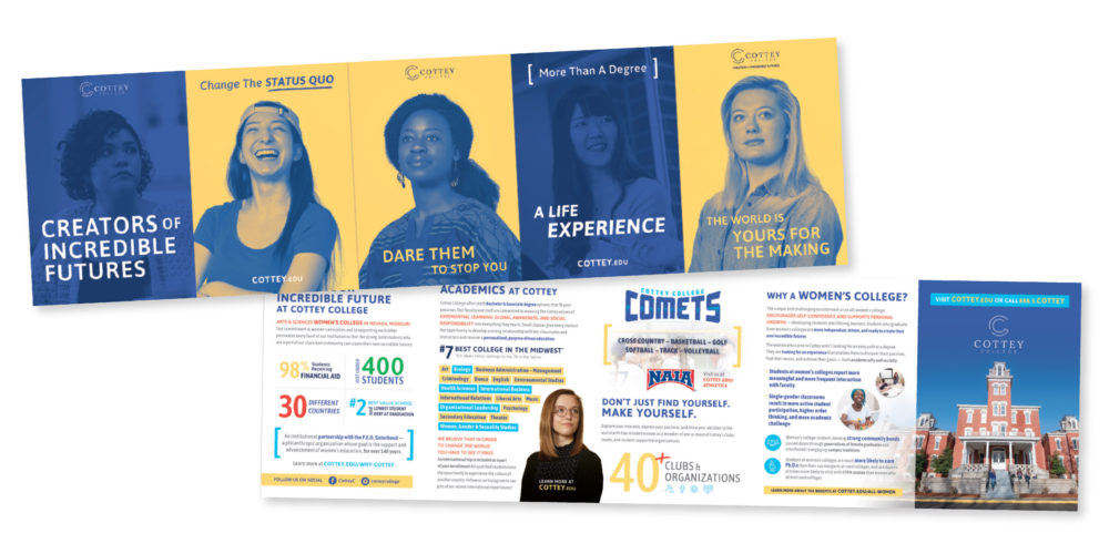
By choosing multiple vibrant and unexpected color schemes for a brand they have an easier time standing out. An example of this practice is best shown in our recent work for Cottey College, an all-women’s college located in Southern Missouri. By leveraging bold, full-floods of color, Cottey has developed a strong, visually modern brand for their school.

  1. Color Gradients / Bold & Handwritten Fonts

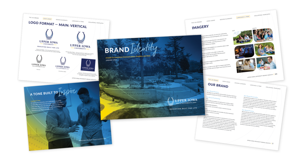
Being raised from the nostalgic grave by the likes of brands such as Instagram, the use of striking color gradients as well as bold, dramatic handwritten fonts has also been on the rise this year. These elements are both represented in our work for our client Upper Iowa University.

  1. Custom Illustrations / Branded Gifs

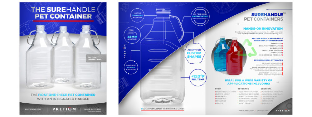
As brands continue to look for further ways of differentiating themselves, we’ve seen a trend in design toward more unique and “ownable” illustrations as well as use of playful animations and branded gifs. We used this approach when rebranding Pretium Packaging. During the process of a brand refresh, we heavily leveraged the unique look of their blue-print line drawings in order to visually tell their story of concept to final production of custom bottles, differentiating them further from other plastics companies.

If you’re looking to get ahead of the curve on design that will carry you and your brand into the future, send us a line. We’ve got the design smarts that are up to date and the design skills that are up to snuff. And if you are interested in more eye-candy, check out the rest of our work here.

Source Article: https://venngage.com/blog/graphic-design-trends/

The Most Patriotic Brands In America

Melissa Ross
Digital Content Producer

The Most Patriotic Brands In America

The 16th annual Brand Keys Most Patriotic Brands in America study has been released, and we’re seeing some interesting trends in terms of patriotic campaigns and who they’re targeting. The survey ranks 297 brands in 2018 that were most resonant when it came to patriotism.

With the current division between political parties within the country, it’s no surprise that we’re seeing a shift of consumers self-perceptions of patriotism and the overall ideology of patriotism with age. The survey found that among those who responded with labeling themselves as “extremely” or “very” patriotic, 85% were baby boomers, 68% were Gen X, 53% were millennials, and 42% were Gen Z.

Though our perception of our own patriotism is shifting, our understanding of brands’ patriotism is being perceived on a deeper level. We seem to be basing it on a company’s actions as much as anything else.

Jeep, Disney and Coca-Cola top the 2018 list in that respective order, which is no surprise to those who read the list last year – all three of which were in the top 4 in 2017. Though we did see some big brands get completely knocked out of the top 50 – Facebook dropped below 50 presumably due to the Cambridge Analytica scandal, and so did the NFL, also presumably over players kneeling during the National Anthem. Also on the decline was Harley Davidson, which dropped 16 points after President Donald Trump’s criticism of the company moving more manufacturing operations overseas.

Because younger audiences are seeing themselves as less patriotic, brands taking the traditional patriot messaging route in a campaign that target these groups run the risk of falling flat. Those that are embracing a more modernized patriotic message, such as Pabst Blue Ribbon with their campaign that explores what the American Dream means to millennials, exhibits a cultural shift in identifying patriotism.

A brand that can engage its audience with a strong emotional value such as patriotism – whatever that meaning is for their target audience – will be believed, ultimately creating a bigger brand trust and positive feeling towards the brand. Brands that make such an emotional connection will always have a strategic advantage when it comes to winning hearts and minds – and loyalty – of customers.

Contact