CHALLENGE
When Harris Products Group developed the Perfect Flame™, they created a production brazing system that revolutionized the industry. Now, for the first time ever, manufacturers have a precise method to control the flame. With a library of up to 100 sharable presets, production engineers can standardize handheld production brazing performance throughout their organization. And it captures important data, which contributes to OEM’s continuous improvement goals. As part of our strategy to introduce this new technology to the market, we set out to educate the industry on the benefits of investing in the Perfect Flame™.
SOLUTION
In order to introduce the Perfect Flame™, we began by branding the industry-leading technology that powers the machine: ViziBraze™. It monitors and reports many important statistics to help managers and operators better control their performance. This was the first time in the history of brazing that end-use customers could ever enjoy this type of real-time data.
We then worked with Harris to coordinate the product launch at the largest international trade show, where we could attract production engineers, plant managers and brazing operation managers to the booth. We targeted a very niche market that represents a huge sales volume: OEM refrigeration coil manufacturers. Building up to the launch, we created a teaser video that showed a practical demonstration and benefit-driven illustration of this all-new ViziBraze™ technology. We then used this to induce them to visit the Harris booth to learn more about the Perfect Flame™, where we displayed the video on a large screen.
We fortified our pre-release awareness strategy by promoting news stories to trade publications while Harris developed an email campaign using the graphics and messaging that we created for the communications strategy. In conjunction with these efforts, we built a microsite, which featured an introductory promotional video that helped support these efforts. Not only could salespeople use this to help secure sales meetings, but it also featured a ViziBraze™ login so production managers could log in to access and analyze their data. When plant managers could see how valuable this data was, they would be encouraged to further implement it at every one of their plants throughout the world.
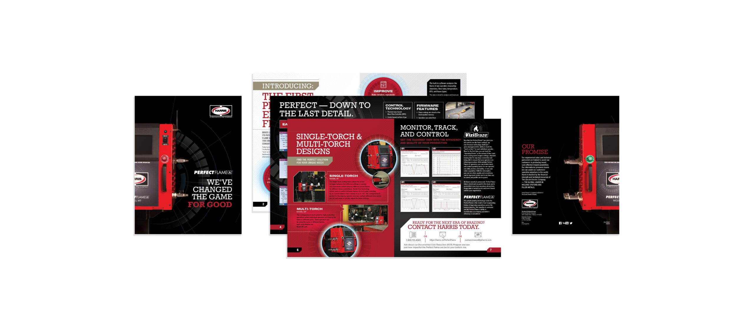
Once salespeople secured a meeting, they could utilize a brochure that we developed to support their efforts during the sales presentation along with a customizable presentation that featured the same graphic elements. Finally, Harris is dedicated to supporting their customers after making a sale, so we created an instructional video that would aid in adapting to this new technology. That enabled a shorter learning curve for the end user for both brazing and utilizing the data in their ViziBraze™ portal.
RESULTS
Harris Products Group enjoyed a highly successful launch, which began with high traffic from engineers at their booth. In fact, it was the most traffic that they had ever seen. The Perfect Flame™ is a big part of Harris’ strategy of working together with their customers to enable a new level of success. Their clients have achieved better control over their operations, a higher level of standardization in their manufacturing, a greater level of first-pass yield and consistency throughout all plants worldwide. It has directly led to Harris landing some very large consumable contracts, which was the primary goal of the Perfect Flame™ launch.
