Marketing, PR and advertising all aim to tell stories of the brand. Telling a story digitally can be a challenge – especially in an industry where the audience is knowledgeable and looking to connect personally in a digital experience. The Equine industry is one that features many great stories of the relationships between humans and horses. In addition to being a labor of love for many involved, it is also a booming business which includes millions of horses and more than 1.5 million jobs. We have learned in our time working with our client, Manna Pro, that success is achieved in the equine industry (and many other similar, niche industries) by telling the audience a story and showing authentic personality through all communication mediums.
A number of companies and organizations accomplish storytelling through custom imagery and video that shows personality. In a world where stock images are everywhere, websites that have their own images really stand out. Some G/Lers met with our Web designer and came up with equine websites that we think successfully connect to their audience by showing personality – from imagery to content:
Note: Our Geile/Leon team has worked on Equine Web Design projects, including Manna Pro Product’s Equine blog. (We got all this knowledge from somewhere!) For the sake of staying as unbiased as possible, we haven’t included that project in the list below, but certainly feel free to check it out!
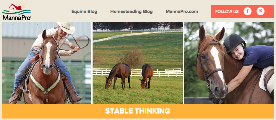 http://info.mannapro.com/equine
trainwithtrust.mannapro.com
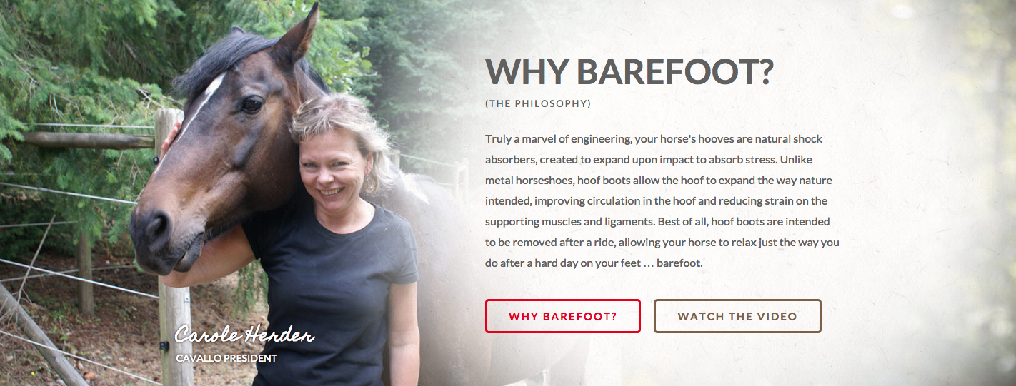
1. Cavallo
Website: Cavallo makes horse boots, saddle pads and equipment for riders. Their website stands out because of strong imagery, easy navigation and a focus on telling the story of how their products help both horses and riders perform at their very best. In addition to the store, the site’s content is boosted by a robust blog, general information on riding as well as testimonials and other information about the company.
Personality: Our team enjoyed how Cavallo invested in original imagery that shows the brand personality and their love for horses. They’re not just selling a product, but also selling a lifestyle. Putting the president of the company with the horses they work with every day makes her seem very down to earth.
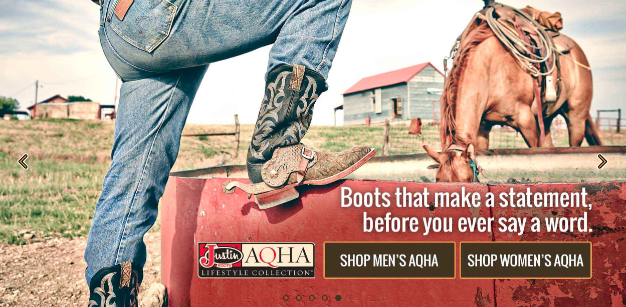
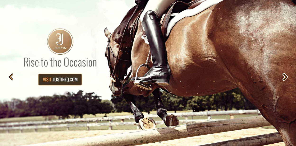
2. Justin Boots
Website: The website for Justin Boots conveys a tone that shows the brand’s origins dating back to 1879 while also focusing on how they’re continuing to improve today. There’s a lot of rich imagery showing different age groups enjoying their products. In addition to still photos, they utilize a decent amount of video to tell more complex stories.
Personality: The website has some authentic photography that features their products and the people that use them. This provides another glimpse into the personality of the brand and how it connects to horses and horse lovers. Reaching across different audiences is tough, but the varying photography also shows how the products work for everyday life as well.
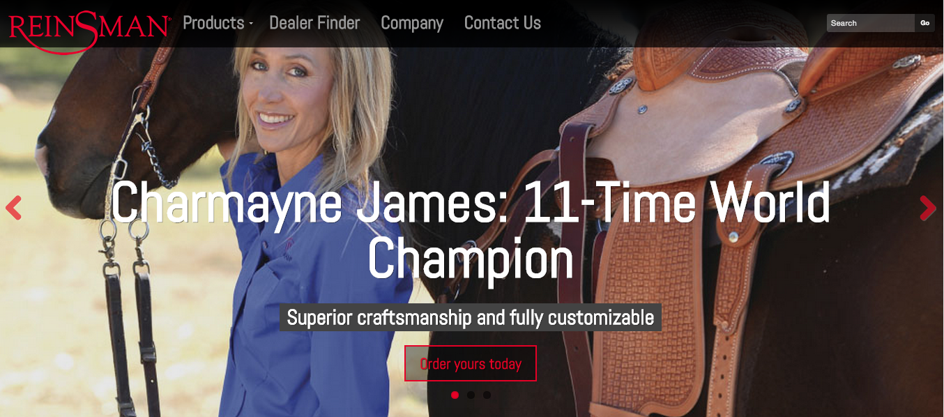
3. Reinsman
Website: The western riding equipment heavily leverages their celebrity/athlete partnerships to highlight the competitive quality of their products. Their equine content is very crisp and well organized.
Personality: Seeing people with their horses and the actual Reinsman products makes the site more authentic. Their focus is more on how the products are more competitive and built to help you compete – showcased well by using images of well known professionals using the products.
4. Grand Meadows
Website: The imagery on the Grand Meadows site does a good job of blending the quality of the product with the effects of what that product brings to the end user. By making that personal connection, it makes the site about more than just e-commerce. Also, having that combination of regular blogging and more in-depth feature articles also helps the site bring in inbound traffic.
Personality: The focus on helping horses grow makes them seem like they truly care about the horses wellbeing, which is really awesome. Seeing the owner insert herself into the brand and the industry also adds a strong personal touch.
5. Noble Outfitters
Website: Another great example of digitally highlighting the culture of the brand. The Noble Outfitters online magazine is updated more than once a week with a good mix of product features and info related to those who might use the product.
Personality: There’s a lot of great original photography that makes them stand out. Their focus seems to be on highlighting the brand will help end users perform better while looking stylish in the process.
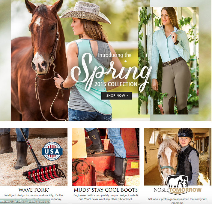 http://www.nobleoutfitters.com
Does your brand tell a story well? Share it with us! Connect with us via @GeileLeonSTL, or just email us at [email protected].
Interested in more of our equine work? Check out our previous blog about equine web design!
