Gliding along for the cultural descent towards the singularity, we are witnessing brands further embracing the warmth of the ever-giving algorithm. Choosing to stand out from the crowd…by not-so boldly blending into it. Over the last few years, a new design trend has emerged. Whether it’s in pursuit of conveying a greater sense of modernity and forward thought or an attempt to protect a brand against unpredictable future cultural criticisms, some brands are abandoning their unique visual identities (and arguably their authenticity) for a series of simplified and minimalist aesthetics. This phenomenon is referred to as “blanding.”
We are gradually finding ourselves adrift in a sea of placid color palettes and sanitized sans serifs. If the exercise of branding is to discover your distinct individuality, and design’s role is to serve as its silent ambassador, then what does blanding hope to accomplish? Well…the opposite of that.
In a time where companies are tasked to take stands and mean something more than a product delivered or a service performed, we seem to be witnessing major brands side-stepping the discussion from a visual identity perspective. The world’s opinion changes too rapidly for them to desire standing out in the crowd anymore. They seem to prefer the safety net of the familiar. The unthreatening. And the unbiased. Since so many messages pose the threat of aging poorly, it feels safer to sanitize yourself. And develop a more neutral persona. But without delivering a unique, memorable and authentic identity…how do you ever plan to excite or inspire brand loyalty?
While I don’t doubt many brands would argue this shift is intentionally done to reflect their dedication to forward thinking and a drive to own a mark that is more easily readable on various digital touchpoints, it’s hard not to interpret the specific design decisions here as a reaction to other trends. Roughly 10 years ago we started having a lot of newer brands who utilize a stripped back aesthetic. Brands like Harry’s Razors come to mind. Here this lack of design provided a level of authenticity and charm that was genuine to small brands who were trying to fill a niche against their larger competitors. Now that those brands have grown in popularity, larger brands want to share that same design language. When you look at it from an algorithm perspective, it makes sense. Users will be fed more of the same content they’ve already interacted with, so it may help to look like everyone else to some degree.

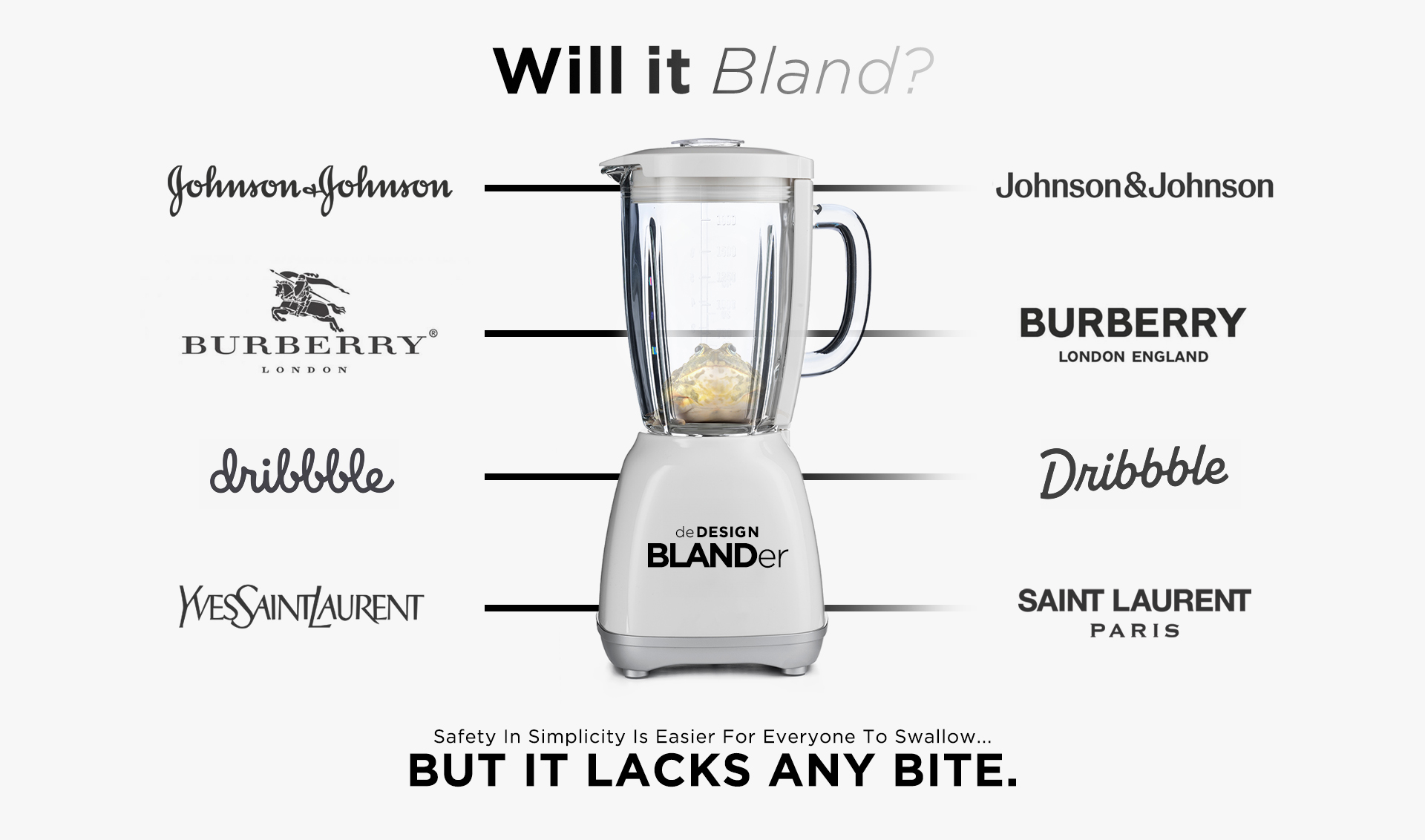
Major examples of brands who have most recently “blanded” themselves include Johnson & Johnson, Burberry and Dribble. And while these brand evolutions aren’t outright offensive necessarily, depending on who you ask, the variety in character, storytelling and instant recognizability between their previous marks and their new presentations is striking.

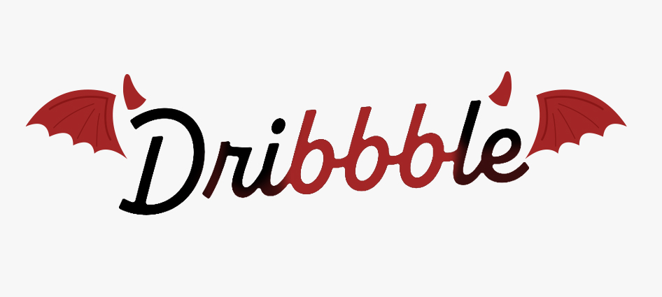
I do appreciate how the triple Bs in Dribble’s new mark share more than a passing resemblance to the mark of the beast. Coincidence you say? Perhaps an omen, I suggest. A message from the ancient design gods, Helveitcus and Bebaszebub. Pleading with us to be weary of further bland, timid identities. We will leave you to decide…but overall, as a designer, I personally feel it’s a shame to see this vibrant and diverse logoscape of legacy marks abandoning so much of themselves through this reductive design exercise. Which feels more like shriveling up to fear than growing the joy to inform. Worse still, I’m getting bored writing about it.
Whether you choose to evolve your brand to be more of a “bland” or not, that evolution should always be strategically driven towards discovering more of a fully realized version of your brand. And delivering a clearer communication of who that is and what it stands for. If that strategy demands a clean, modern sans serif and nothing else…maybe bland simply is your brand. Congrats! But it takes a skilled partner with the knowledge and industry expertise to help brands navigate their own unique messaging through an ever-changing cultural landscape. To stay authentic while still connecting with your evolving audience. At the end of the day, it is always good for any brand to be reassessing and evolve themselves, but it should be done with deeper purpose and intent, empathy and above all else…with the greater goal of making those changes truly mean something.
If you’d truly like your brand to stand out, to make an impact and to reflect who you are as an organization, whether it’s through developing a brand voice and messaging or brand identity, product/corporate naming or a logo design/refresh, let’s talk. We can save your brand from bland, making it relevant to your organization and your market. Get in touch with Tim Leon at [email protected].

