 It’s been some time now that we’ve worked closely with our client (and friends) at XIOLINK, the industry leader in fully-managed IT solutions. XIOLINK acts as an extension of a business’ internal IT department, which frees up their time to work on more strategic IT initiatives that help grow their business. There’s no red tape, no hoops to jump through. So, when it came time to do a website overhaul, it was critical that our team approached the design and content organization in a way that spoke to XIOLINK’s key audiences – c-level executives of mid-market enterprises and IT directors. Read on for multiple perspectives of how we worked to bring the XIOLINK website to an even truer representation of their state-of-the-art facility and identity.
Account Executive: Erin Gitau
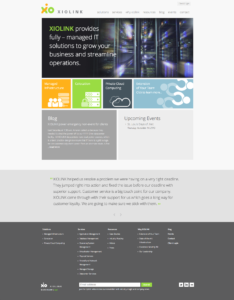
“Design and content organization were two key factors considered when we approached the new site. Their previous site was a bit dated and didn’t demonstrate that XIOLINK is a leading technology company. It was imperative that the new design reflected XIOLINK’s identity, industry knowledge and expertise. They’re a leader; let’s prove it. When it came to content, it was important to get to the point, ‘Who is XIOLINK, and what can they do for me?’ Plus, we needed to organize the content in a fashion that catered to their two main target audiences. The outcome was easily-digestible content presented clearly to each decision-maker.”
Designer: Adam Arriola
“There was one main driver in the design and layout of the XIOLINK site: this is an external sales tool, and we need to acknowledge and provide focused solutions that apply to each decision-maker. What’s our key message and how will we communicate it to the c-suite and IT audience members? That’s where the tiles came in – they provided an intuitive grid and an easily accessible path. Throughout the site, we organized the information in a simple categorical way to serve the site user. From the hierarchy of content to the point size of the font, we aimed to develop a sophisticated, timeless design that is up to the standard and true to the XIOLINK identity.”
Programmer: Marcus Griffen
“By designing in a tiled structure, we were able to provide the same effect to two different user interactions. The hierarchy of content isn’t compromised from desktop to mobile. That was important. The readability was also under high consideration with the substantial number of mobile and tablet users. Internal pages have content left and navigation right. The initial navigation is quite clear, so by placing the content far left, we indicated it was worth the read.”
In result, if you visit XIOLINK.com, your user experience is intuitive, the site is visually interesting and you have the opportunity to explore if XIOLINK is the right fit your business. Check it out and let us know what you think.